
Ran’s Construction — Brand Identity
Building Strength. Powering Possibilities.
Ran’s Construction is built around two core areas of expertise: reliable construction and professional electrical installations. From residential homes to commercial offices, the company needed a brand identity that communicated strength, technical skill, reliability and versatility.
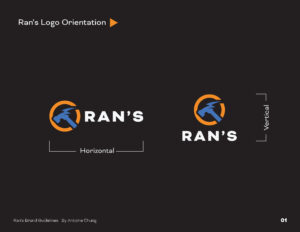
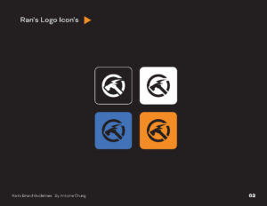
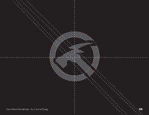
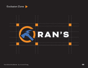
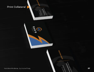
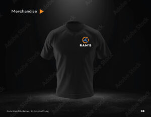

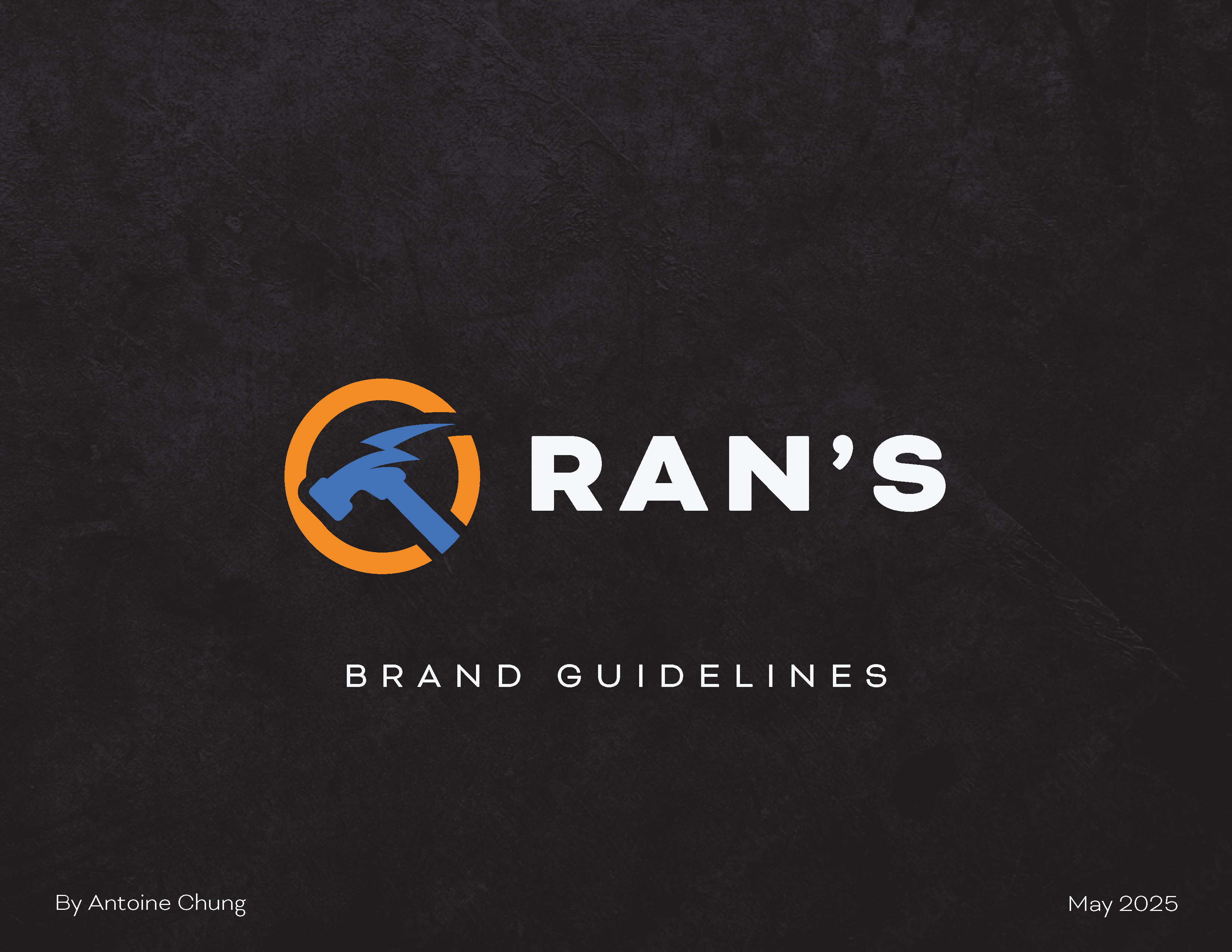
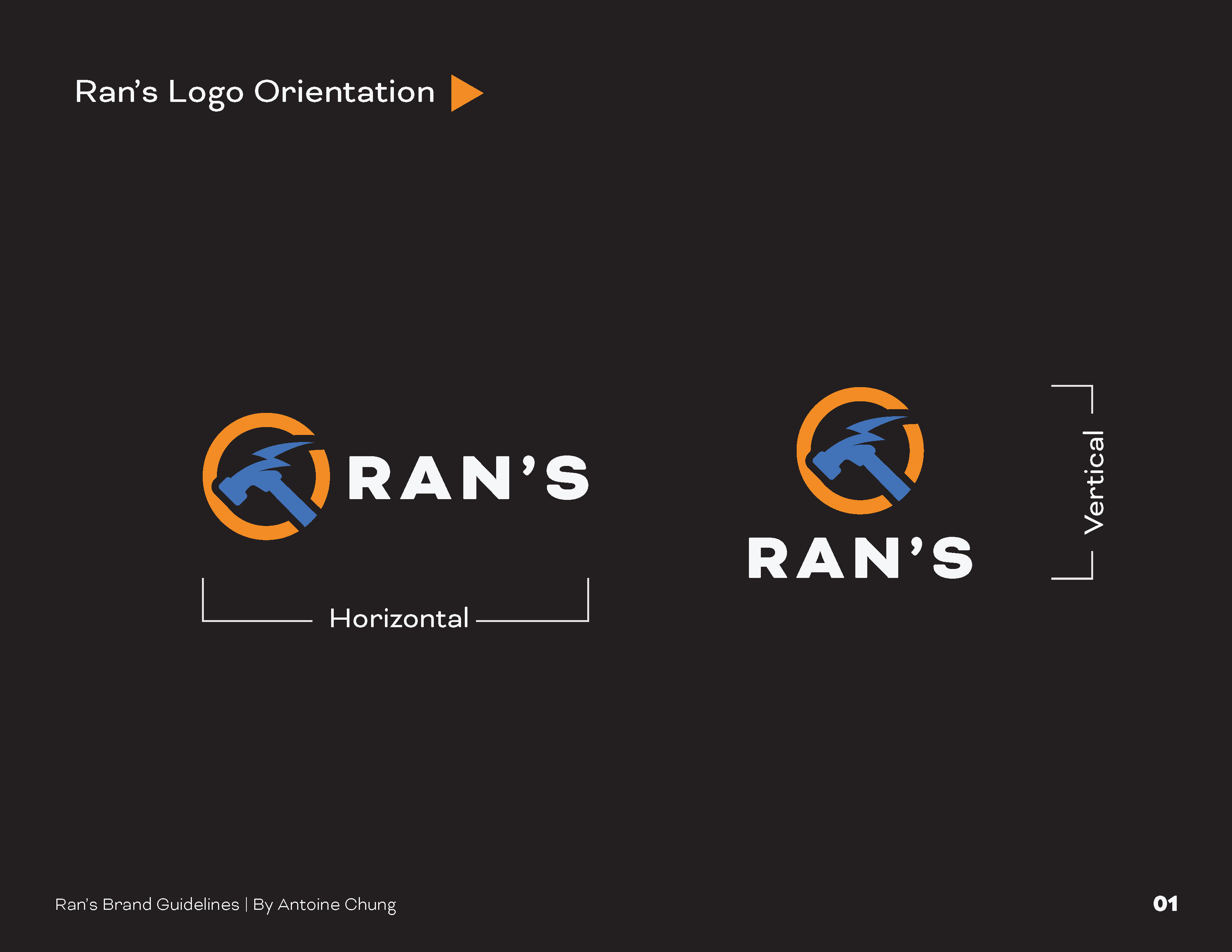
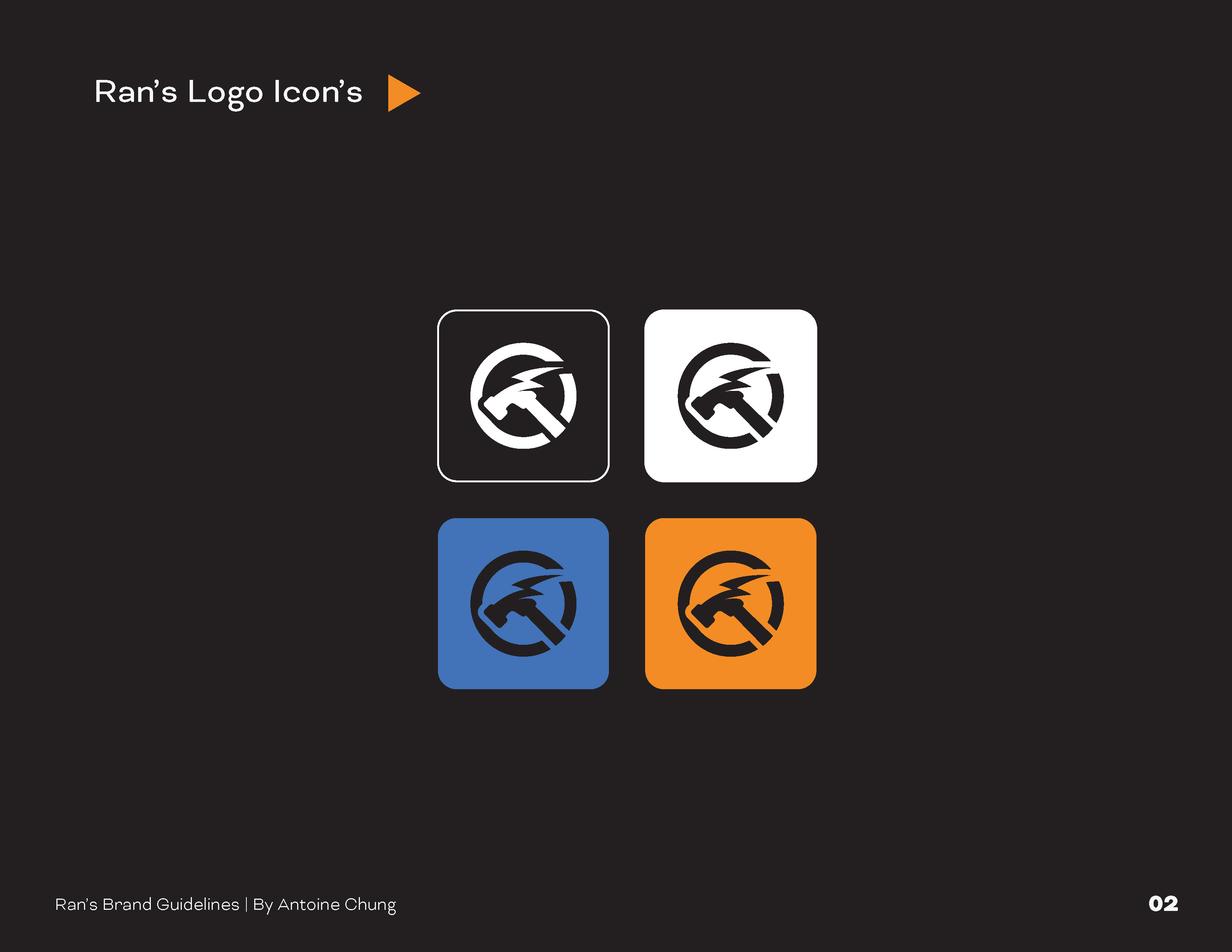
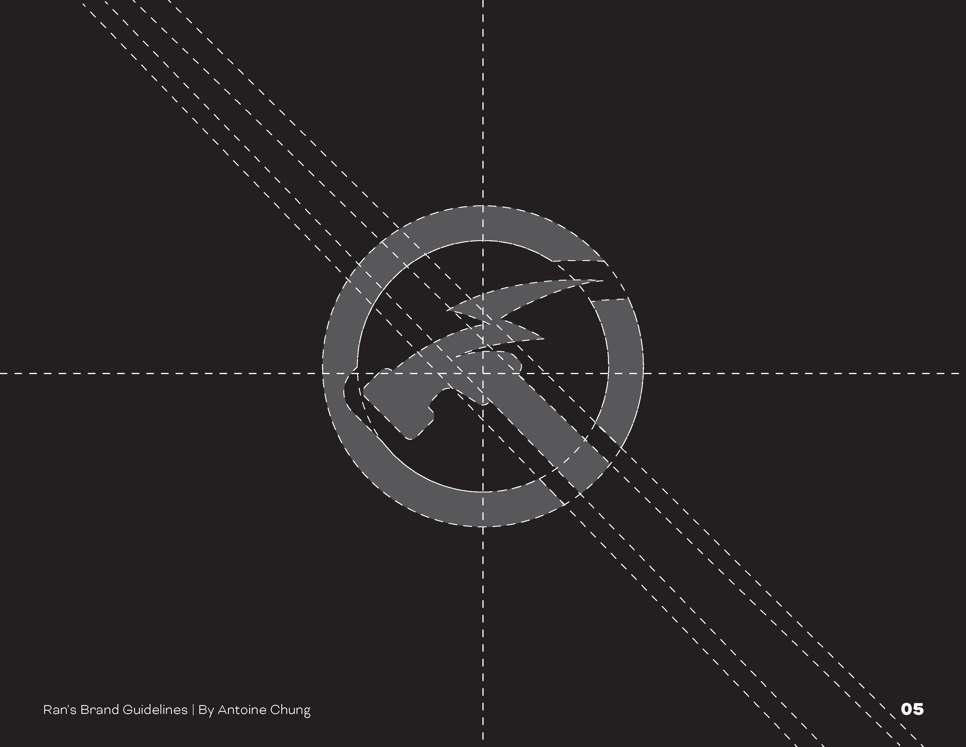
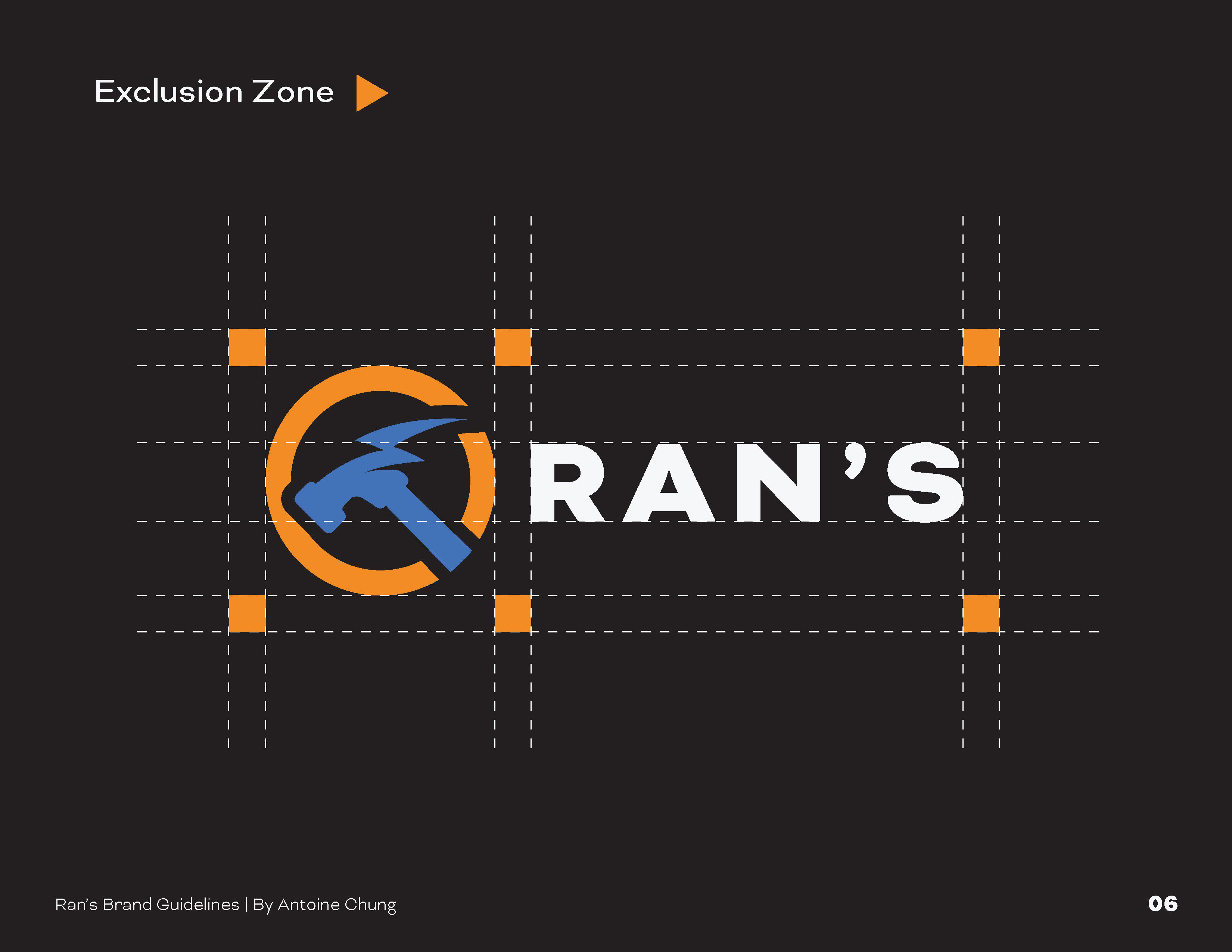
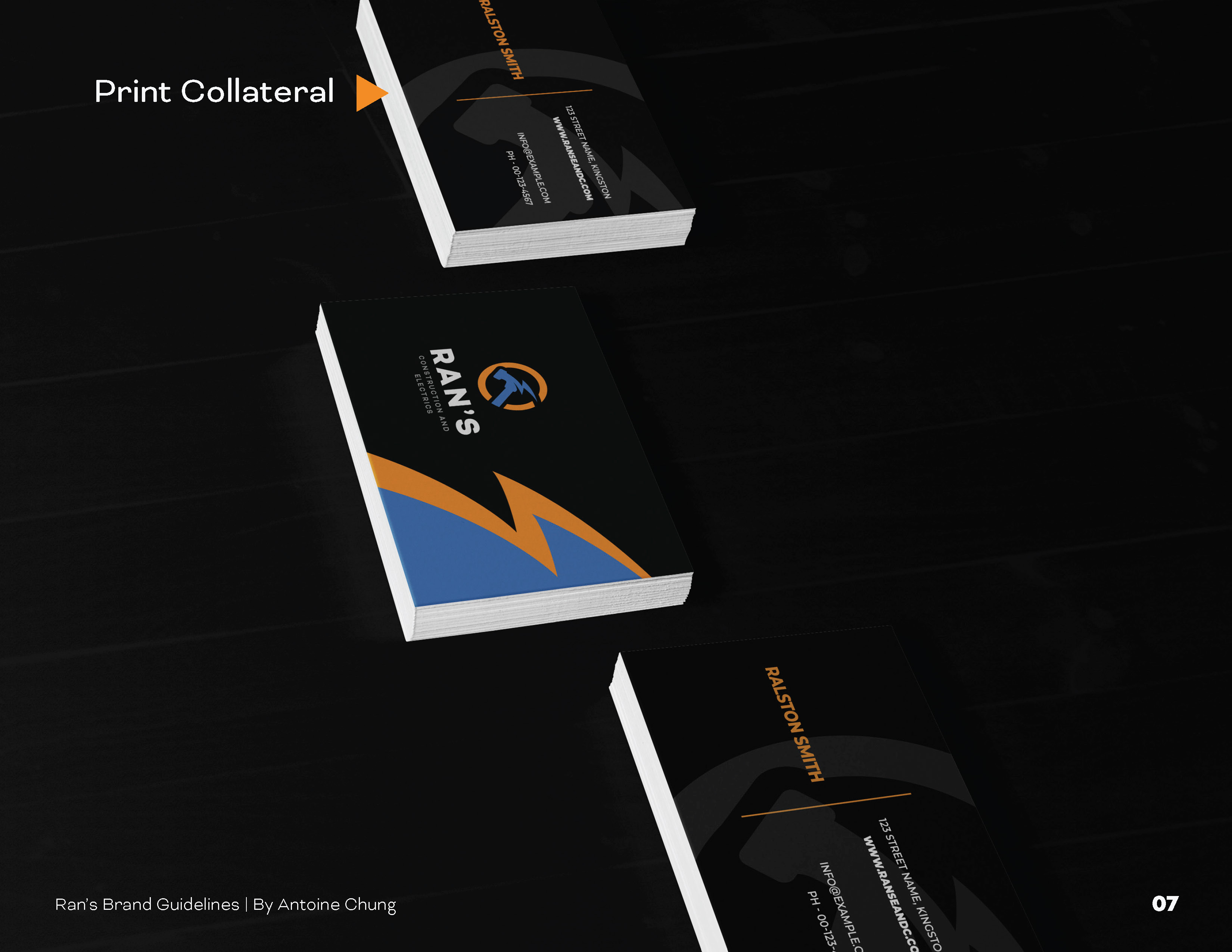
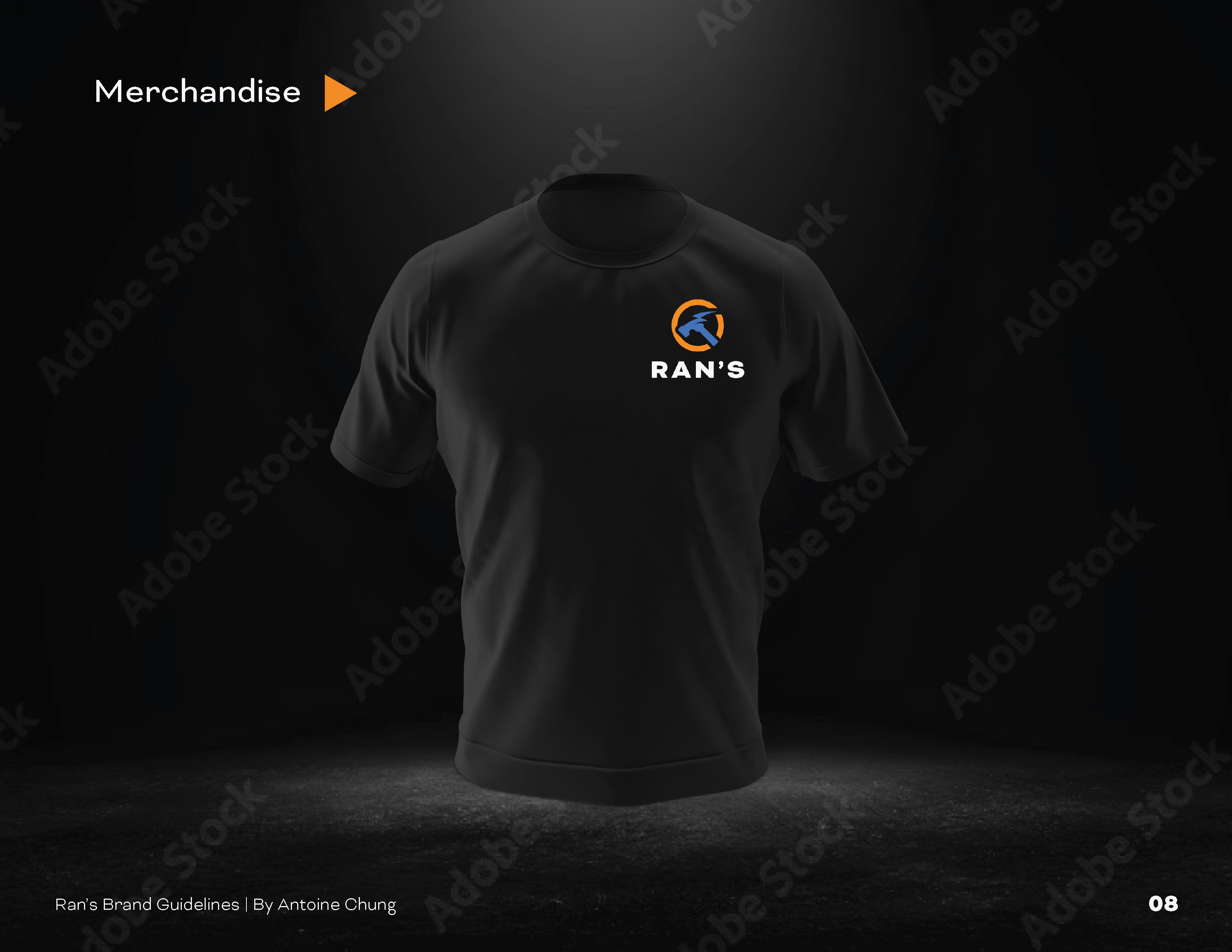
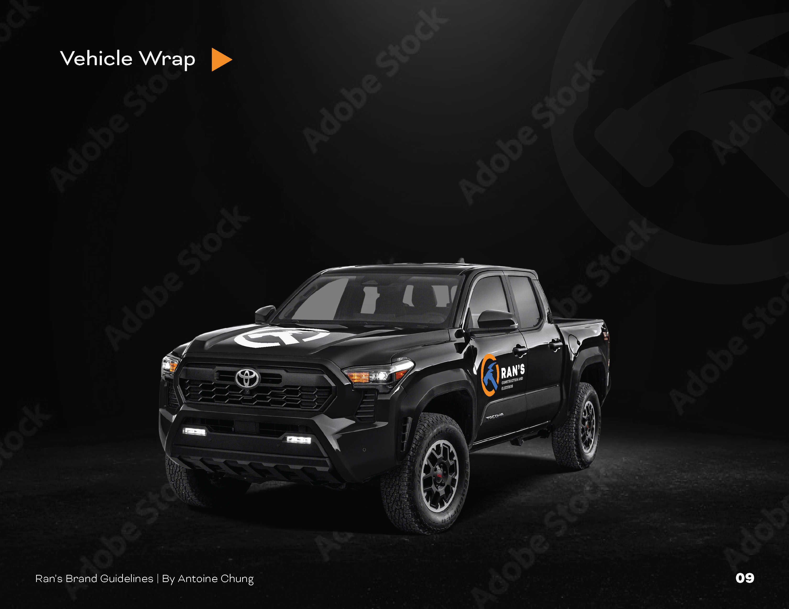

The visual identity was developed by bringing these two services together in one distinctive mark. The hammer represents construction and craftsmanship, while the lightning-inspired element reflects electrical expertise and energy. Enclosed within a bold circular form, the logo creates a strong, recognizable symbol that reflects a company equipped to take projects from structure to power.
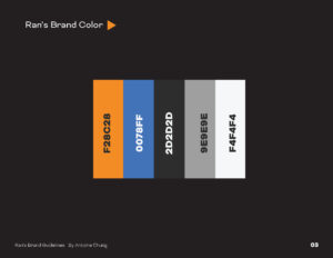
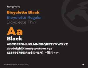
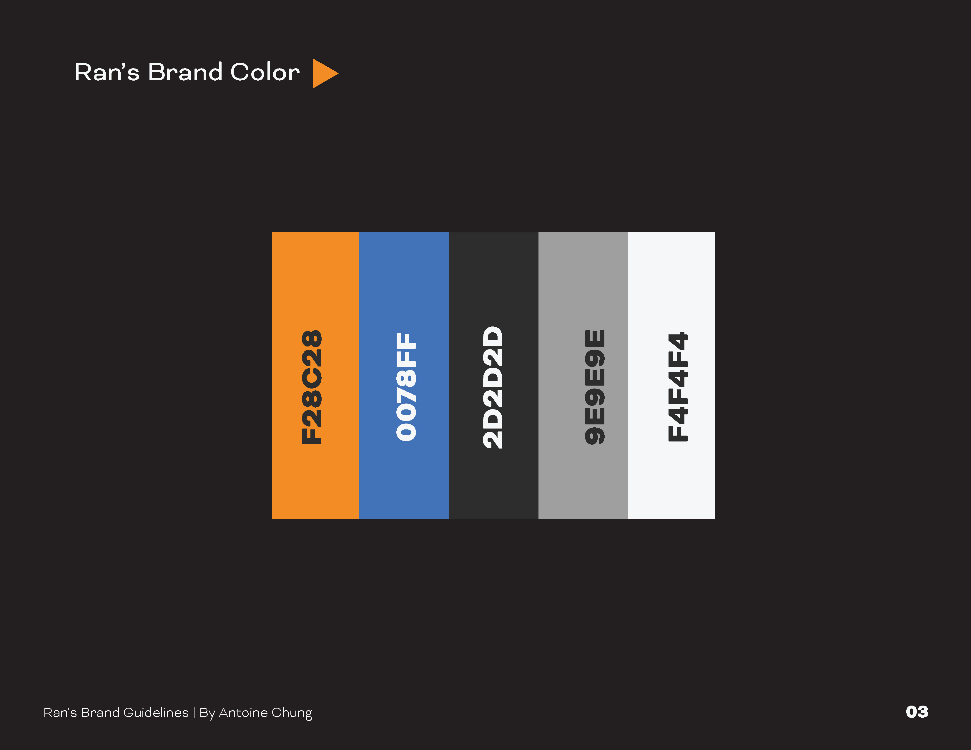
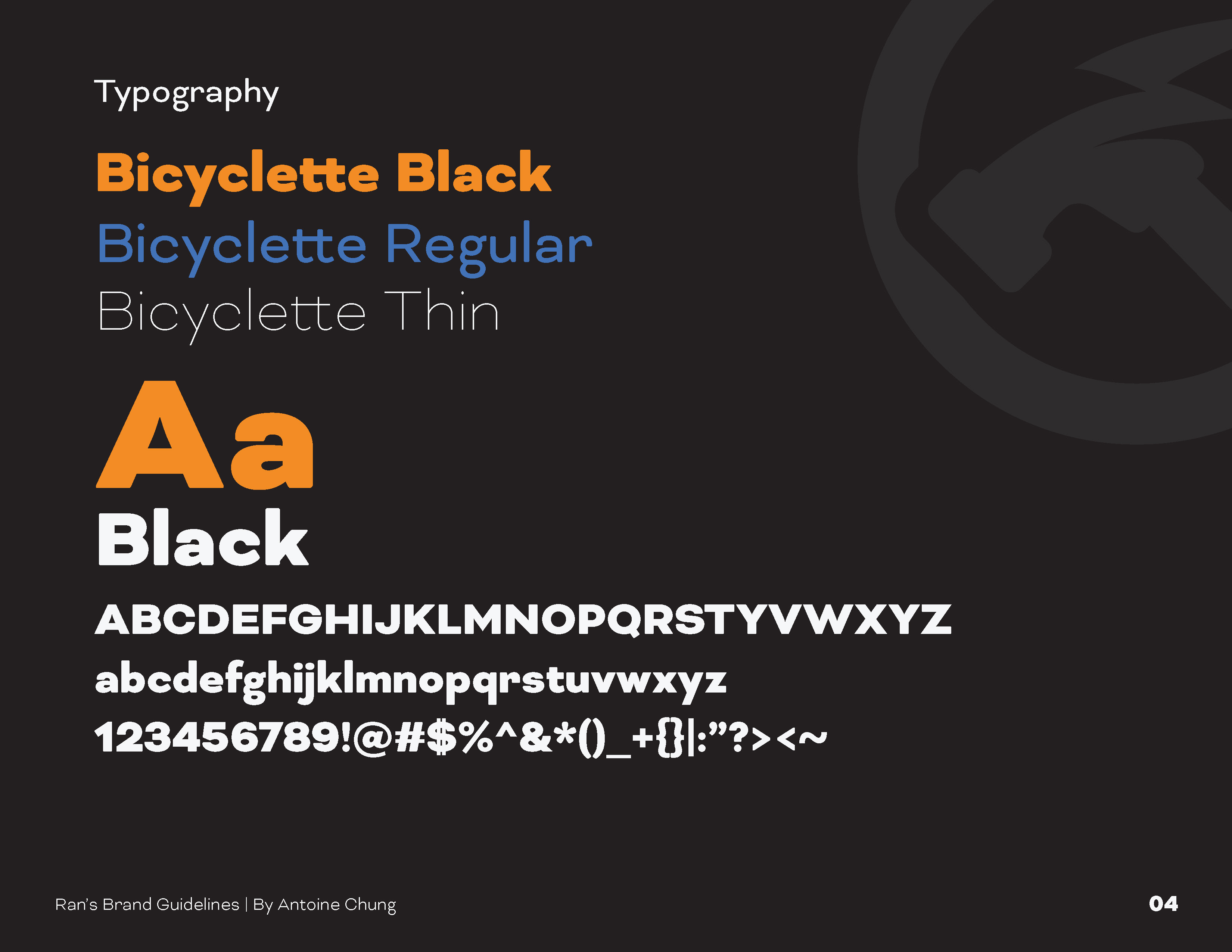
A vibrant orange and blue colour palette reinforces the concept—orange conveying energy, confidence and construction, while blue communicates trust, professionalism and reliability. The bold Bicyclette typeface complements the identity with a modern, sturdy character that gives the brand a confident presence across print and digital applications.
The result is a cohesive brand identity that positions Ran’s Construction as a dependable, skilled and modern construction partner, ready to build and power spaces for both residential and commercial clients.

Harness the Power of Effective Communications
Better branding. Better attention. Better conversion.